
Syntec Numérique changes its logo!
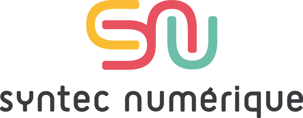
Businesses are changing, the world is changing… And it’s time for Syntec Numérique to change too!
How do we do it? By embodying a new visual identity. The new logo unveils a unique symbol that illustrates the creation of links and connections through digital technology.
The logo also takes on new colors to embody vitality and diversity, and a new rounded typeface to illustrate proximity and empathy, notions dear to Syntec Numérique.
I hope you enjoy it as much as we do!
In June 2018, Syntec Numérique presented a redesigned logo using a symbol of connection, refreshed colours and a rounded typeface. The redesign aimed to express proximity, diversity and the growing importance of links created through digital technology.
A visual identity matters when it helps members, partners and the public recognise an organisation’s purpose. This piece is a retrospective of Syntec Numérique’s branding at that moment, rather than an announcement about Numeum’s present visual identity.
Professional representation works best when elected members can connect broad economic debates with practical needs encountered by companies. Governance should give different communities a fair opportunity to contribute, including software publishers, digital service companies and technology consultants. Clear mandates, transparent decision processes and regular dialogue with members support credibility. When reading an older election result or appointment, it is useful to distinguish the person selected, the position they were selected for and the particular term of office concerned.